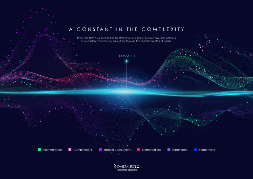
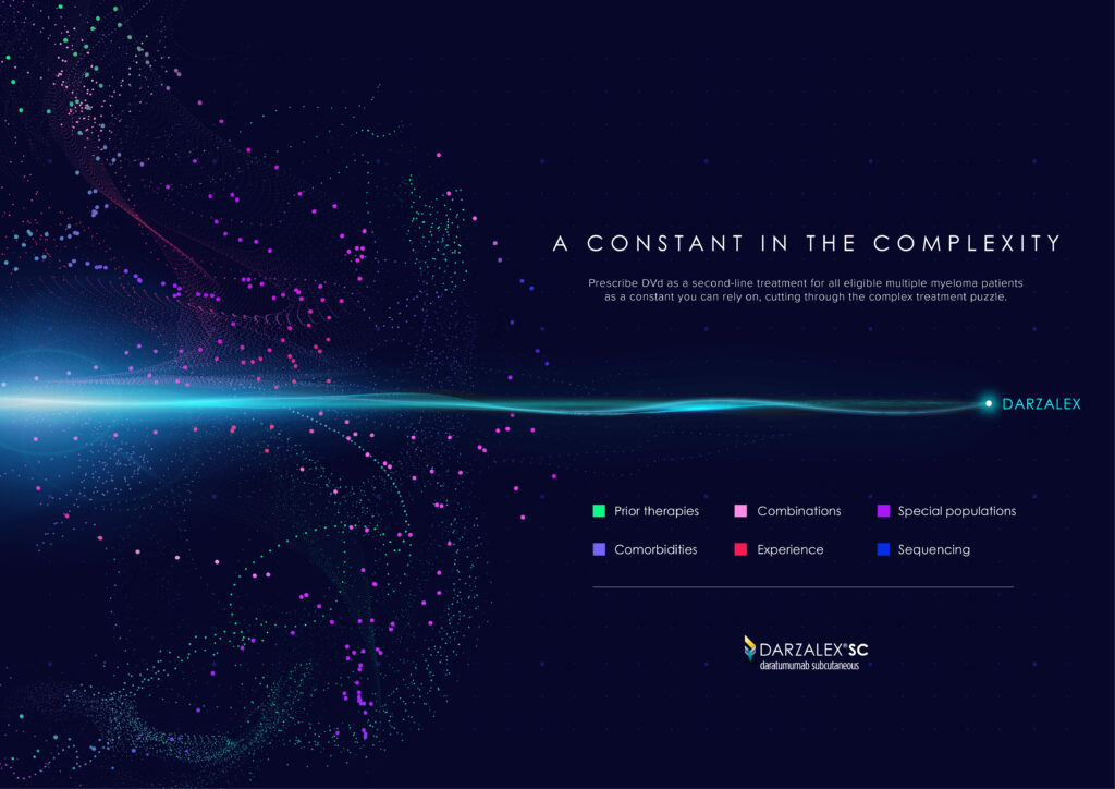
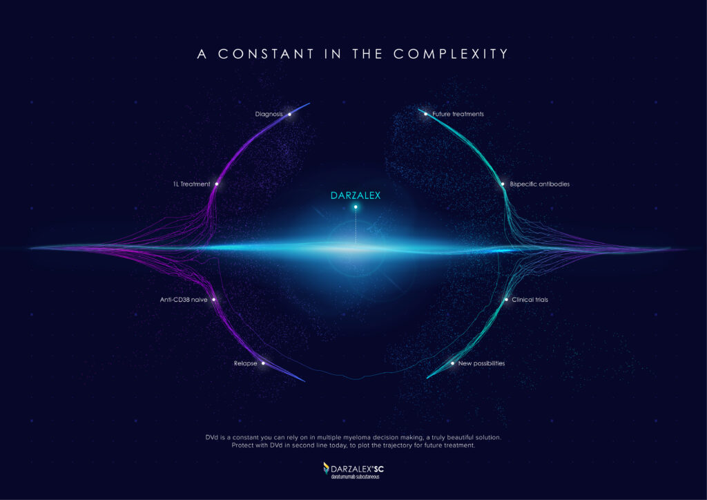
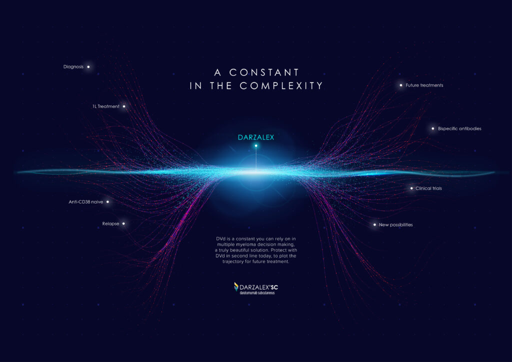
A CONSTANT IN THE COMPLEXITY
For DARZALEX, Johnson&Johnson
THE CAMPAIGN
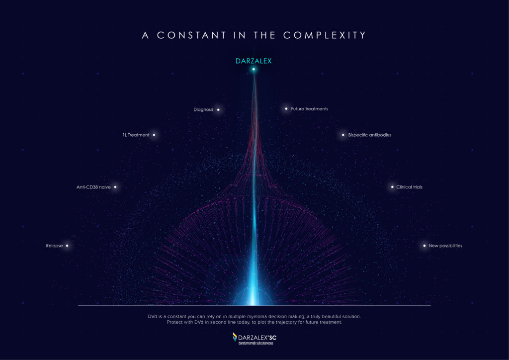
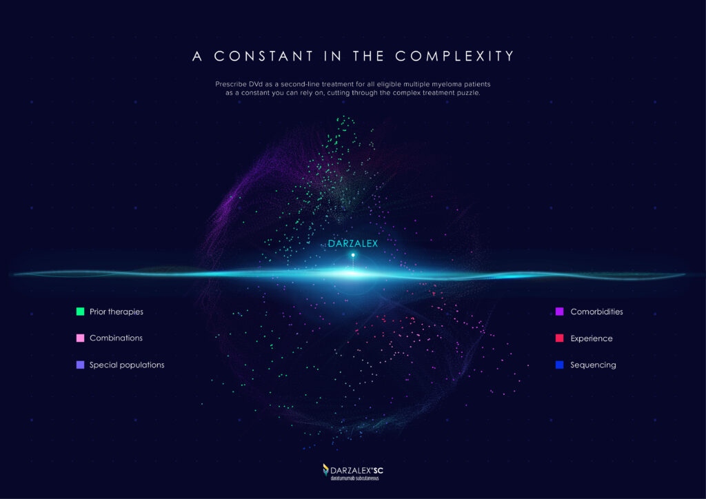
Facing a diagnosis of advanced-stage cancer, especially 3rd line Multiple Myeloma, can feel incredibly overwhelming. The path forward is filled with challenges, decisions, and a flood of medical information that can make the journey seem isolating and uncertain.
In these difficult times, having something reliable to hold onto is crucial. Darzalex, developed by Johnson & Johnson, offers that reliability. It’s more than just a treatment—it’s a constant in the midst of the overwhelming chaos that comes with managing cancer. Amid the endless data, clinical trials, and medical analyses, Darzalex remains a steadfast source of hope.
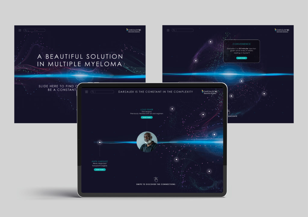
This campaign was designed with that idea in mind. Using modern data visualization in an abstract form, it represents the chaotic experience of a 3rd line Multiple Myeloma diagnosis. At the heart of this visual narrative is a steady blue line, symbolizing Darzalex, that remains constant throughout the swirling particles and abstract galaxies representing the challenges patients face.
By grounding the campaign in both the scientific and emotional realities of cancer, we aim to provide patients with a renewed sense of hope. Even in the face of overwhelming obstacles, Darzalex stands as a reliable companion, offering stability and strength when it’s needed most.
