THE PROJECT
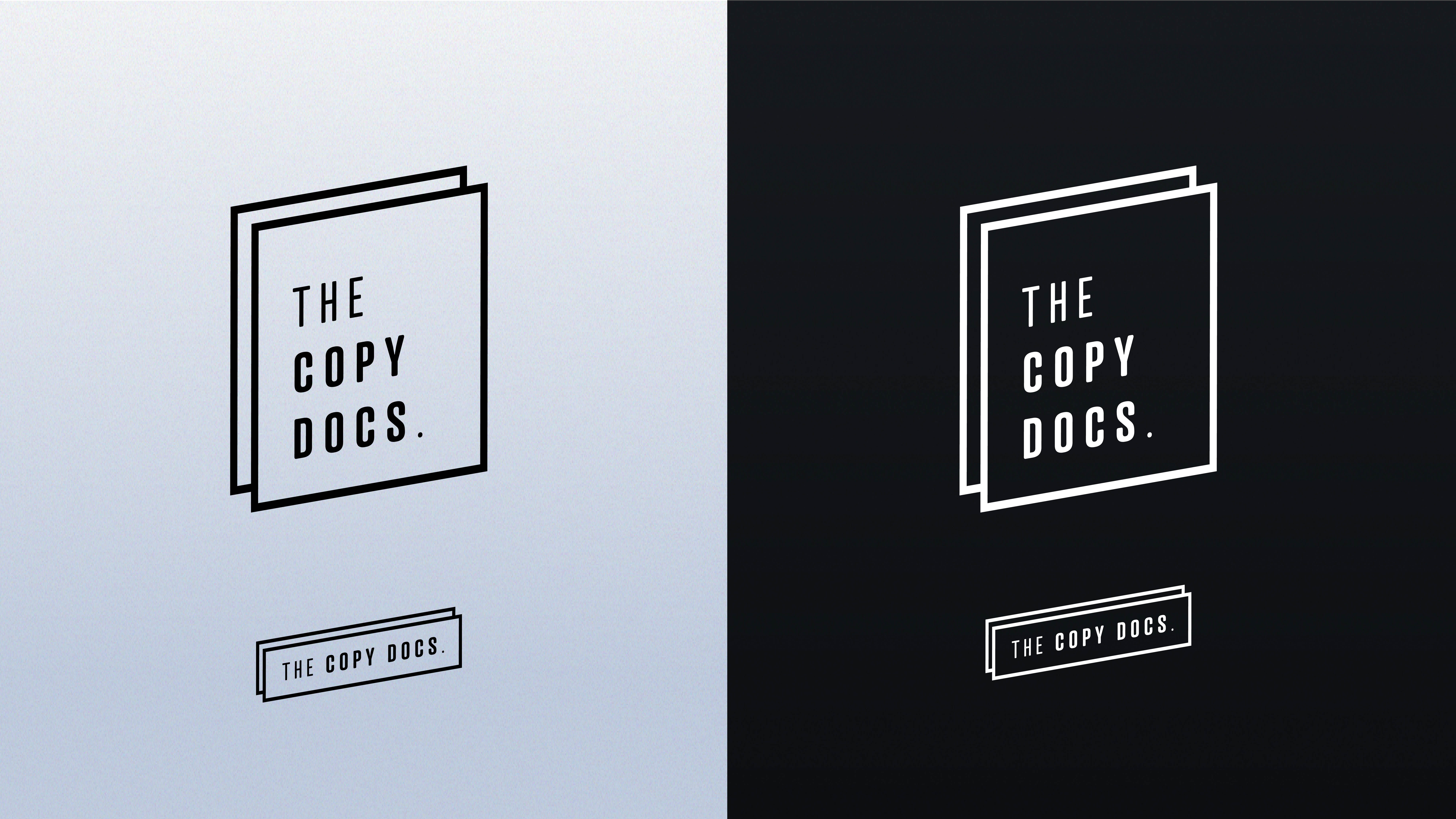
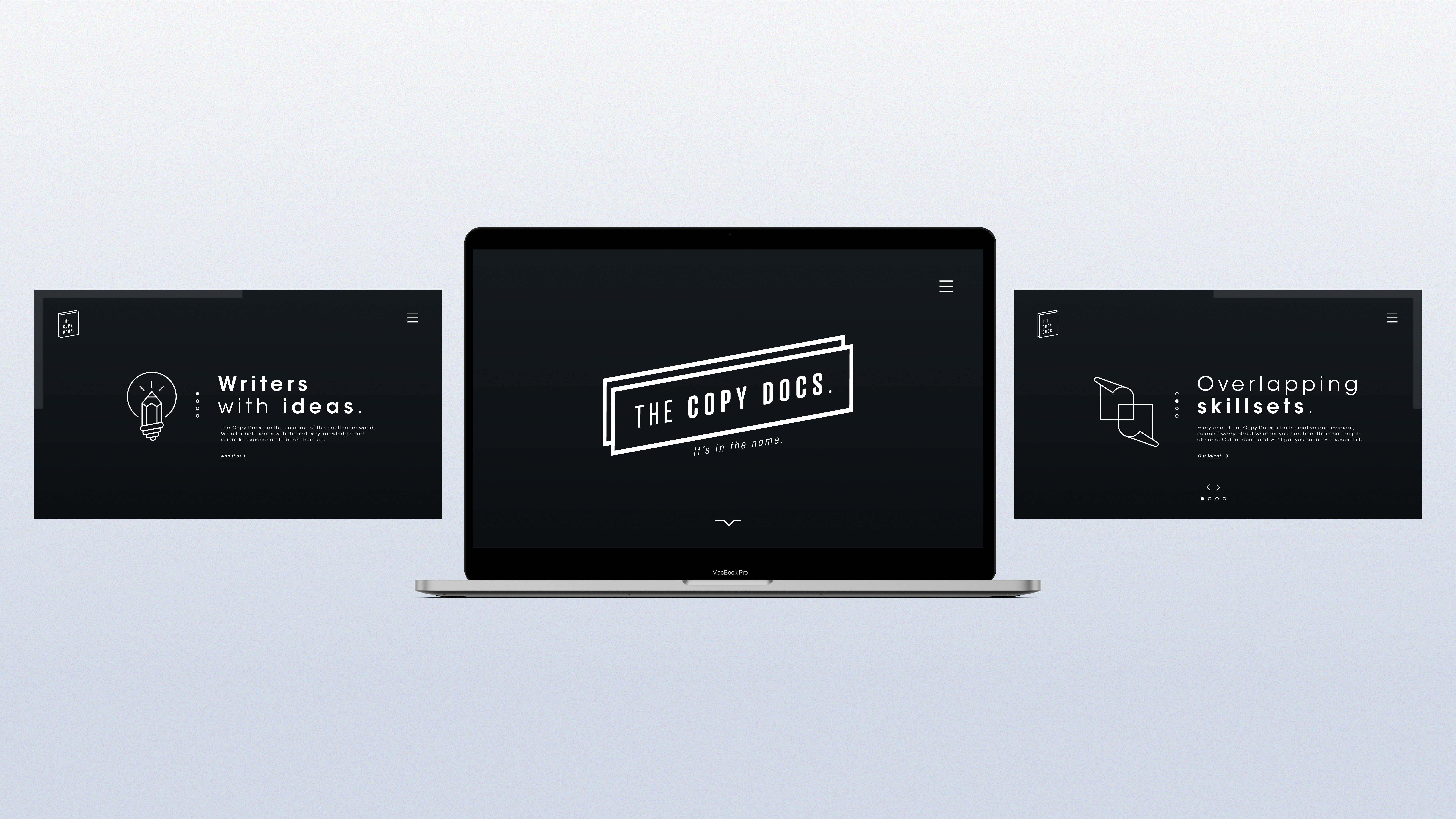
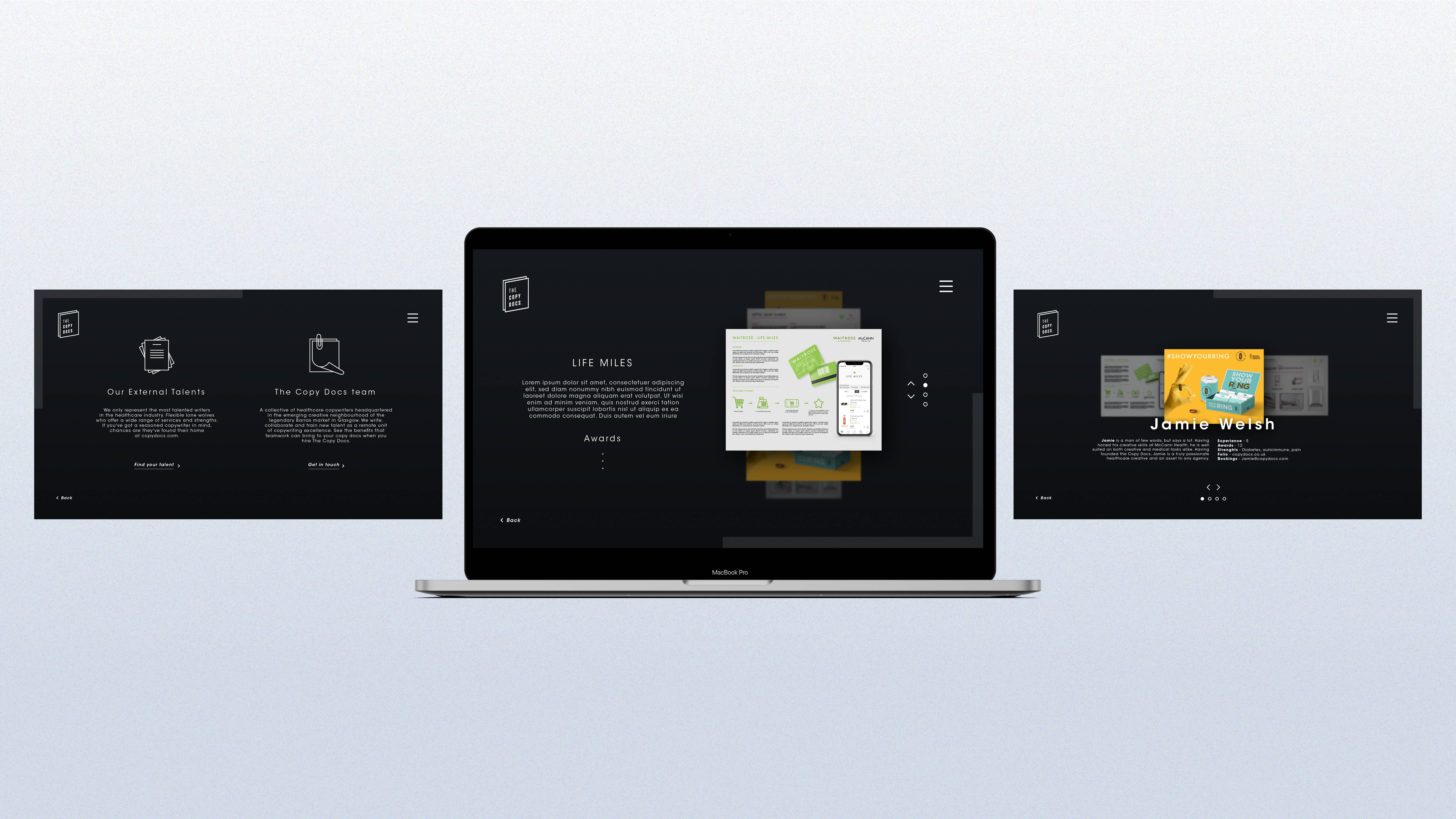
The Copy Docs is a new collaborative agency, which is home to copy writing, medical knowledge and creativity. Their key word is ‘Less is more’. With a witty state of mind, they needed a logo and a website (not a branding yet!) that reflects their values: efficacy, accessibility, passion and modernism.
With a minimalistic approach, the identity came quickly together. Bold and striking font, yet clean and engaging, a logo that says it all, a dark and distinctive background to add the modern twist… The UX/UI design of the website is intuitive and fluid, supported by some animations that engage the audience.
My role:
Analysing and understanding the client’s needs, creating moodboards for the client to choose the art direction, designing the logo, creating the overall look and feel, creating the hierarchy and the UX of the website, applying the look and feel to the UI, designing the animations